Responsive design for Saas invoicing app in 3 months
I fully developed, designed and tested invoicing app at Bonanza studios. *Designs were anonmyzed because of the NDA
I fully developed, designed and tested invoicing app at Bonanza studios. *Designs were anonmyzed because of the NDA

In the market, there wasn't any simple and dedicated solution for doctors to manage and charge their patients. Doctors needed to rely on outdated systems, and 3rd party integrations
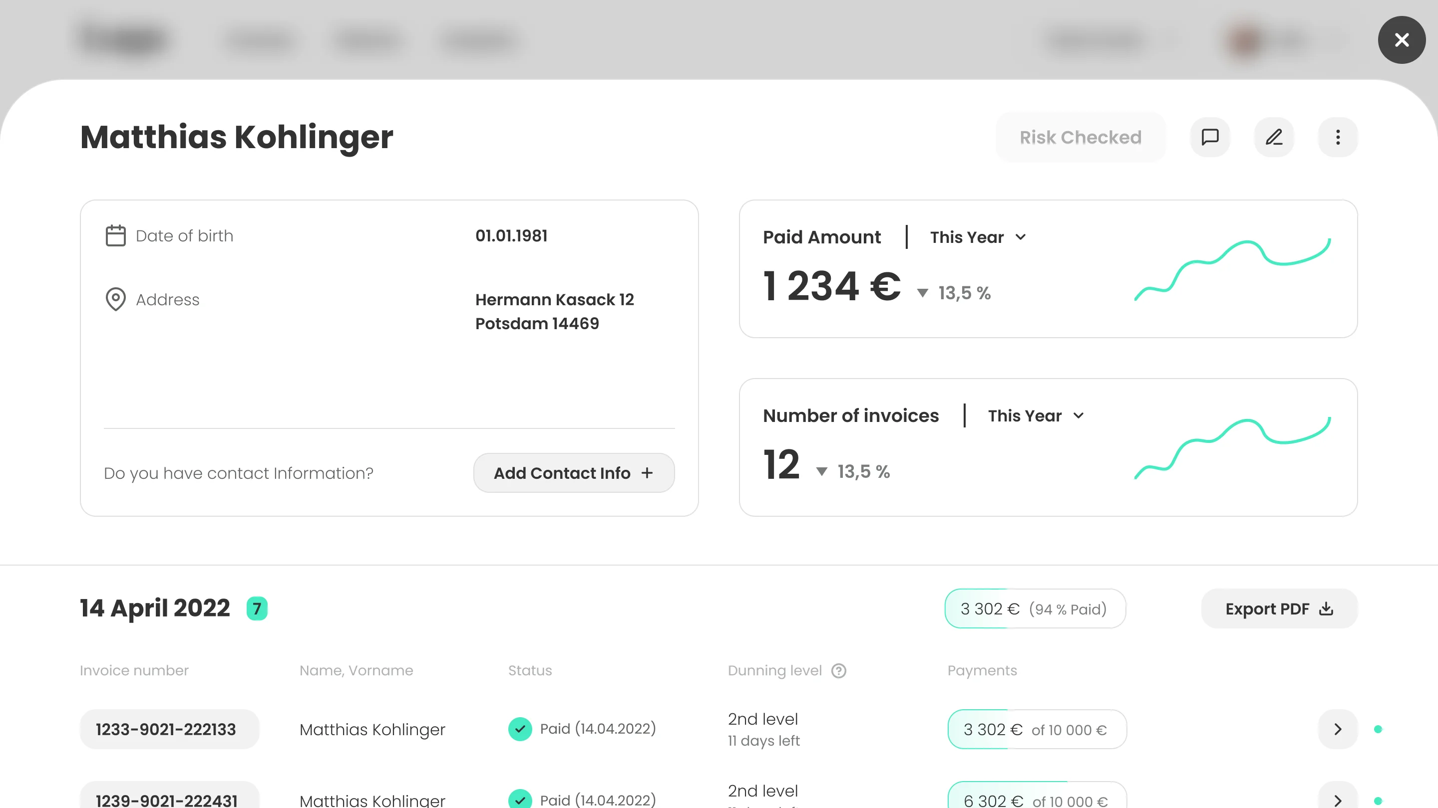
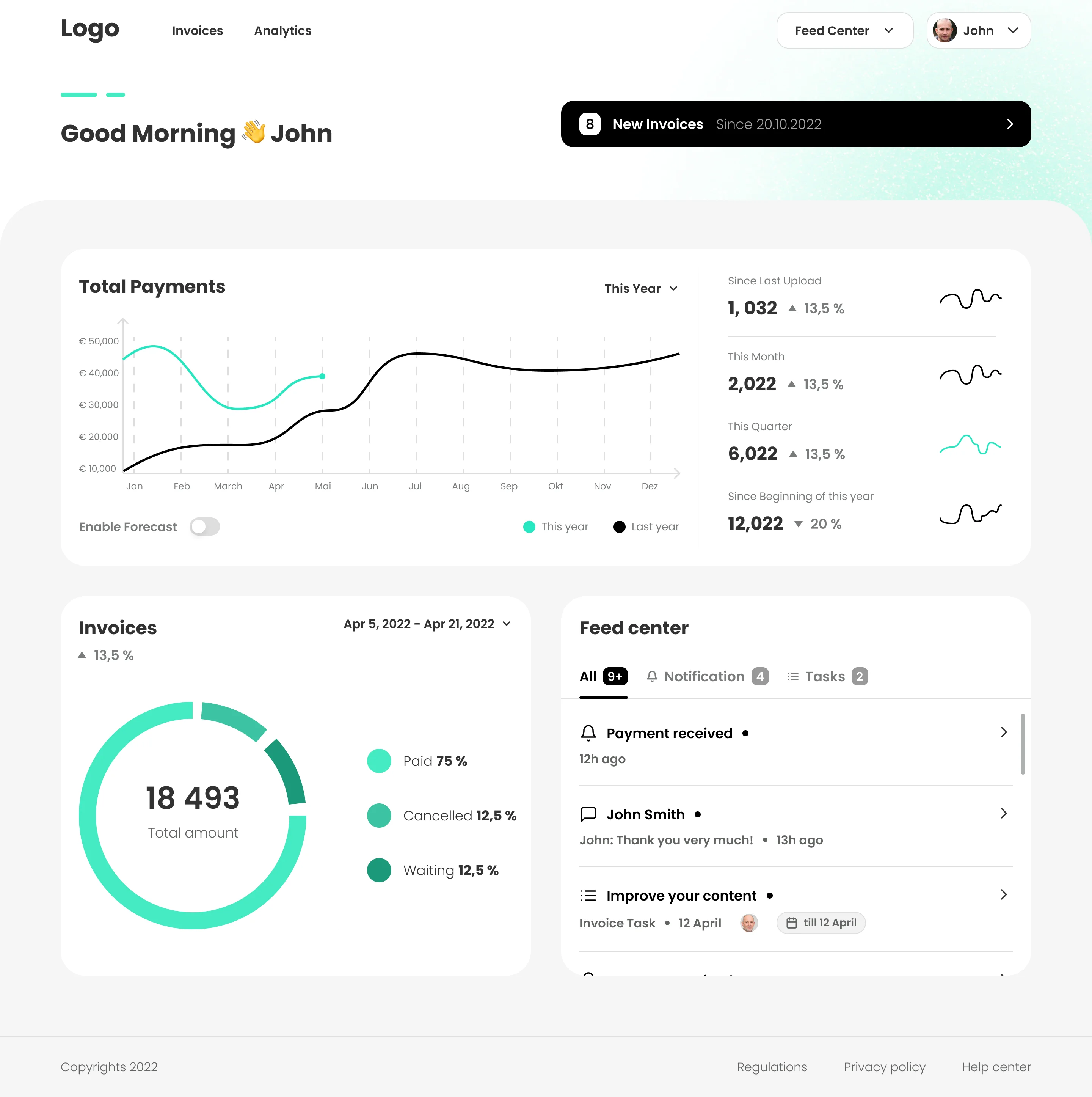
In just 3 months designed fully responsive invoice app. This involved market research and competitors analysis, user testing and creating patient site of the platform
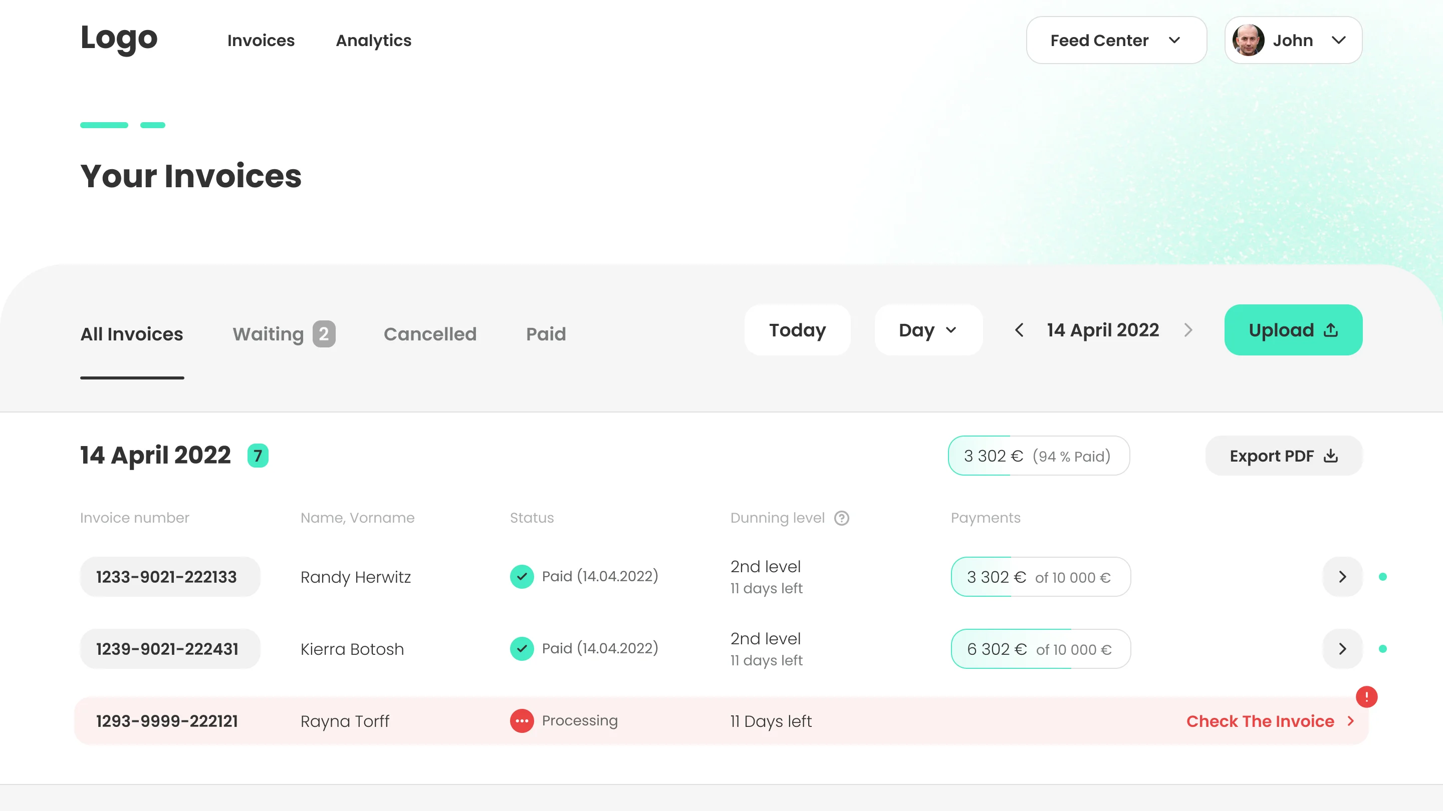
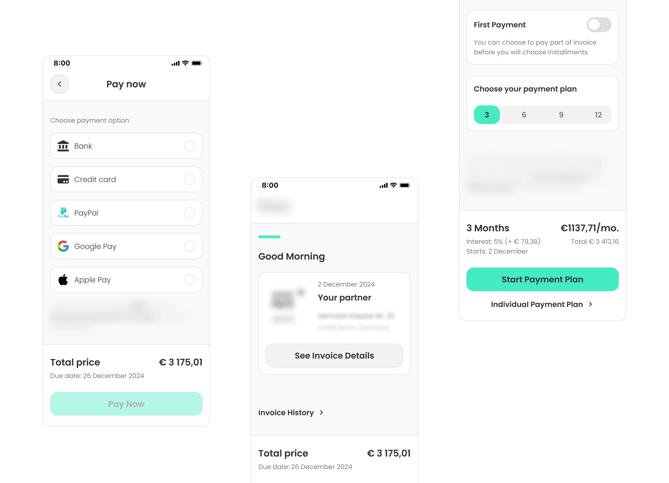
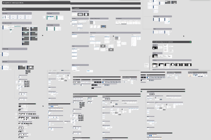
🗓️ Kick-off and competitor analysis: I went through key functionalities to fully understand the problem
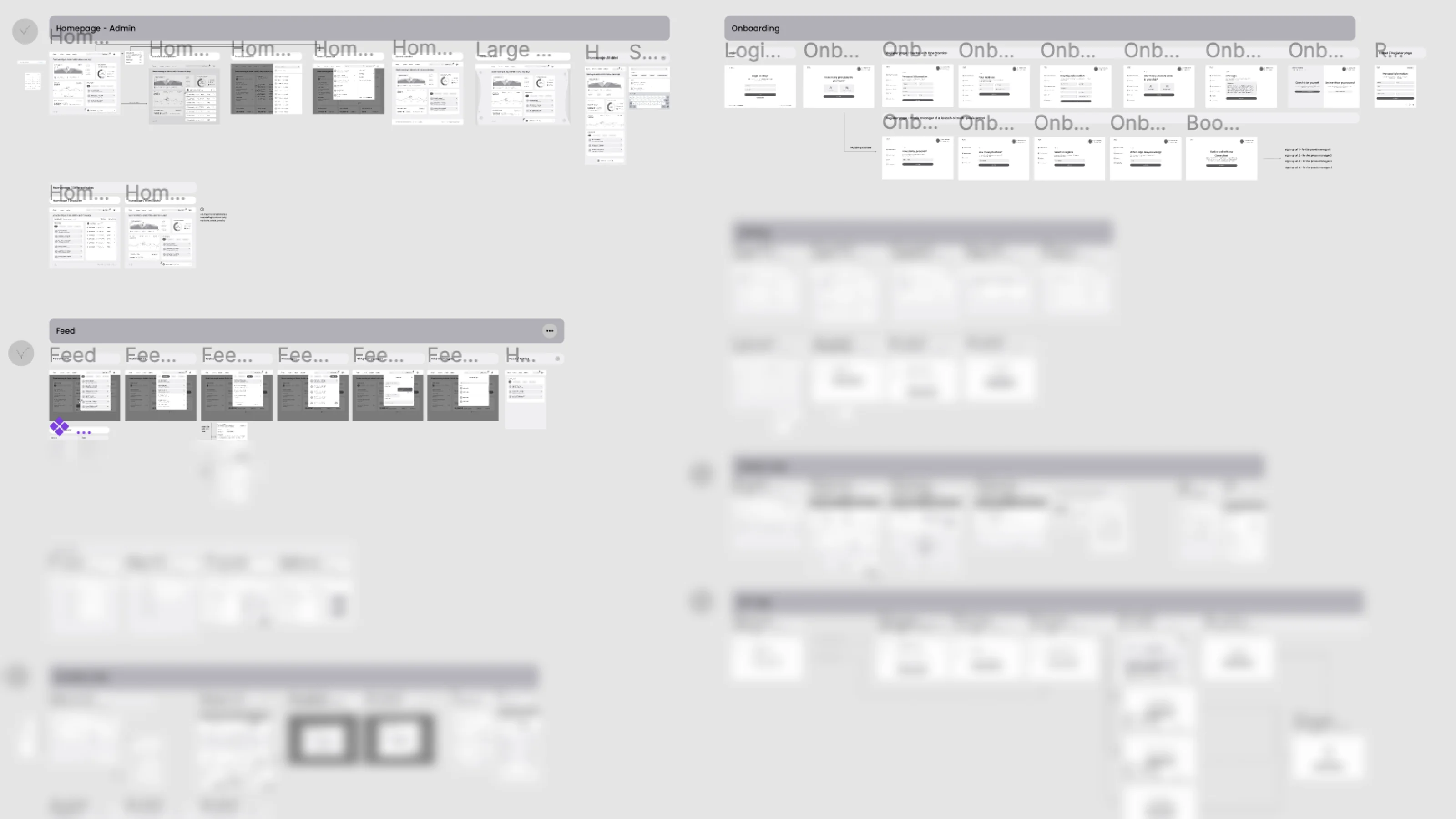
🛠️ User flow and wireframing: As the process was pretty complicated, I needed to design clear user flow, and after catching up with the client moved to lo-fi wireframes
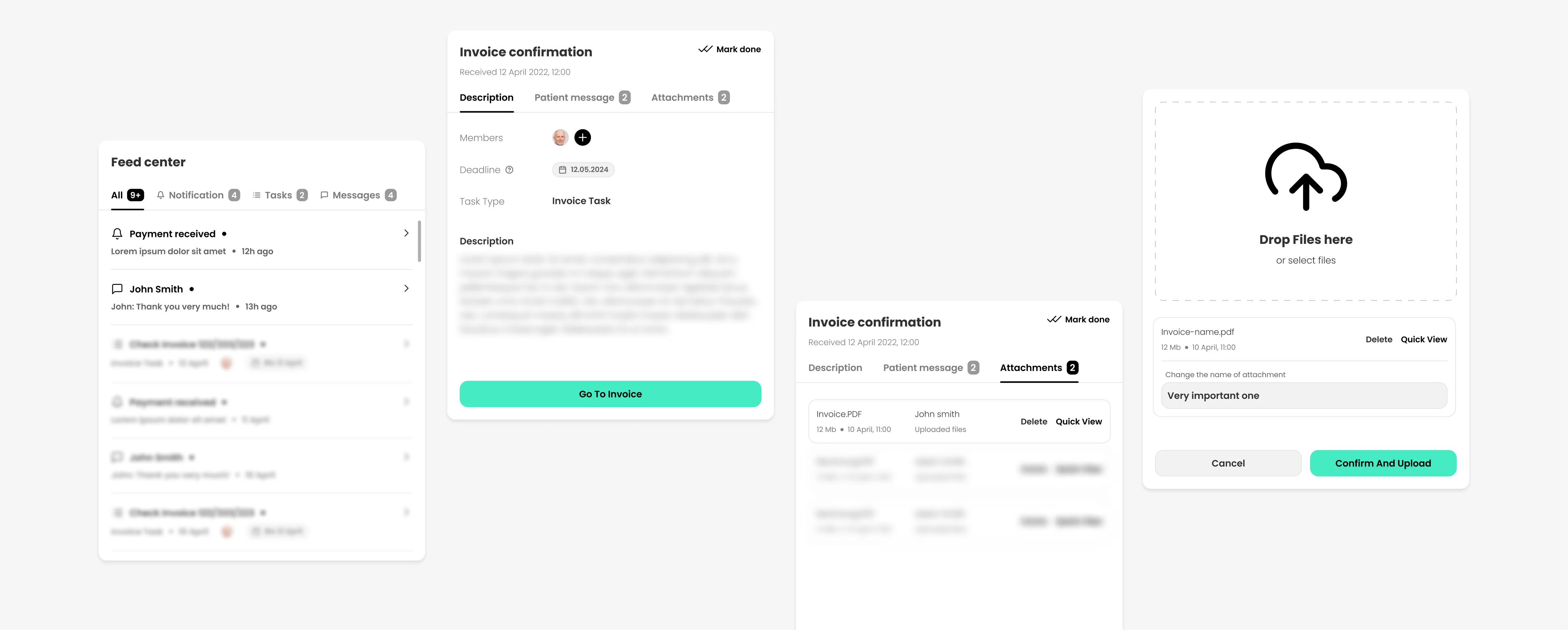
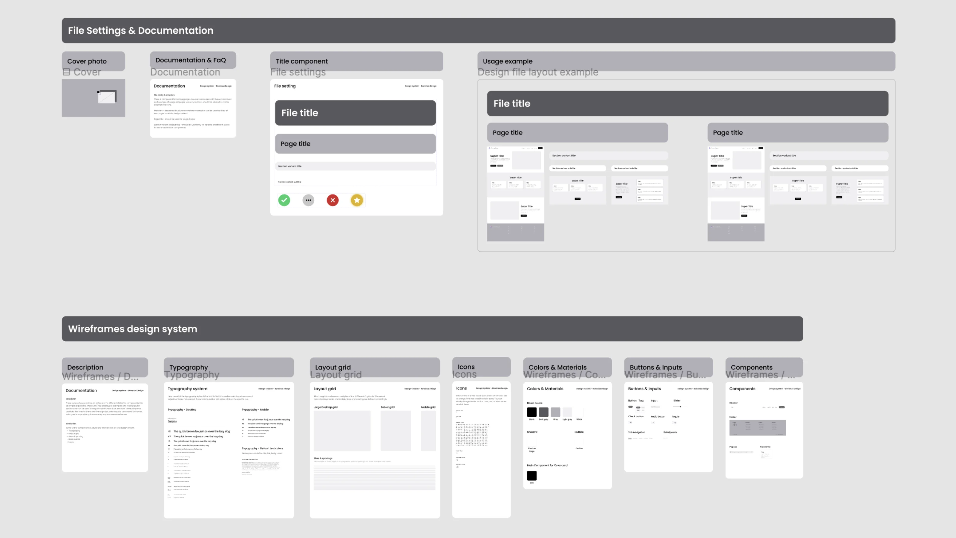
✅ Hi-fi & design system creation: Because of there was a lot of functionalities, to actually maintain and improve the app, I needed to create a basic design system
👩💼 User testing and iteration: Due to time constraints, we've managed to do only 5 user interviews. Based on the results we iterated on the app and prepared for delivery
✅ Daily reports: To make sure we are on the same page, I offered daily summaries of my work with the plan for upcoming days
✅ Weekly workshops: I've conducted 2 workshops per week, to align on the main topics and update the whole team
✅ All-in-one mentality: To keep the work for the clients as easy as possible, we kept all of our work in one Figma file + always kept it clean, so every person that jumped in the project could understand what's going on
✅ Being open from the day one: I like to work in honest and open environment, that's why we shared all of our files with clients from the day one, so they can check progress any time they want
The most challenging part really tight timeline. We only had 3 months for the entire project, which involved patient and doctor side of the app, payment module and landing page with branding
To achieve this results that fast, I needed to develop proper design system, so that all designs could be updated with just couple of clicks. Unfortunately auto-layout wasn't there yet, when the project was under development, so it still needed a lot of manual adjustments
